Product Design
Transforming IT Request Fulfillment: A Case Study on the Employee Portal Application for Blue Harbor
Let me take you through the process of designing the Employee Portal Application for Blue Harbor to improve the IT Ticket raising flow.
* Blue Harbor is the fictional name for the client I worked for with TCS.

Employee Portal Application

About
As a Designer at TCS Interactive, I designed the mobile app called Employee Portal Application for TCS client Blue Harbor (Fictional name). The Employee Portal Application is a creative solution to make IT requests easier for everyone at Blue Harbor. This project is all about designing a mobile app that lets users raise requests or report IT issues without filling out a form. The app uses a smart automation-first approach to quickly handle these requests, granting access to software or services with just a click. The current way of doing things, where users have to create tickets in ServiceNow, is causing some challenges in terms of efficiency and user experience. Our vision is to get rid of this manual process and bring in a more modern approach.
Need of Employee App for Blue Harbor
At present, the ticket system of Blue Harbor is handled on the web portal called Service Now. The request fulfilment is primarily a manual engagement process – a ticket needs to be created by the end users in ServiceNow. The ticket items are manually fulfilled by support groups. The overall ticket volume is resolved manually through the suppliers' teams. The automation backlog based on the first automation assessment will result in overall annual savings of ~$760k. The employee app will be pivotal in achieving end to end automation for these requests.
What is a Ticket
Ticket refers to a digital representation of a request or task submitted by an employee. The ticketing system serves as a centralized mechanism for employees to communicate their needs or seek assistance, providing a structured and traceable way to manage various requests within the organization.
Trying Existing Services
To better understand the context of raising the ticket, its end to end working, different services provided by ticket raising portal and the difference between the different categories of the tickets, I tried to raise the several tickets myself. The journeys and connecting pains/gains I experienced were summarized in a Customer Journey Map, that we used to base questions on for the next step; interviewing end users.
Target User
End User
An end user refers to the ultimate consumer or individual who directly interacts with and utilizes a product, service, or system. In the context of our Employee Portal Application (EPA) project, the end user is any Blue Harbor employee seeking to engage with the application to fulfill IT requests seamlessly. These users include individuals from various departments and roles within the organization, each with unique needs and preferences.
Interview
Interviews with 4 end users and 2 Admins users were conducted to find out what the peaks and pits in the experiences of raisining the ticket from existing ticket raising web portal(Service Now). The interviews were also used to find out behaviour patterns around Ticket Raising, such as motivation and barriers.
Data Synthesis
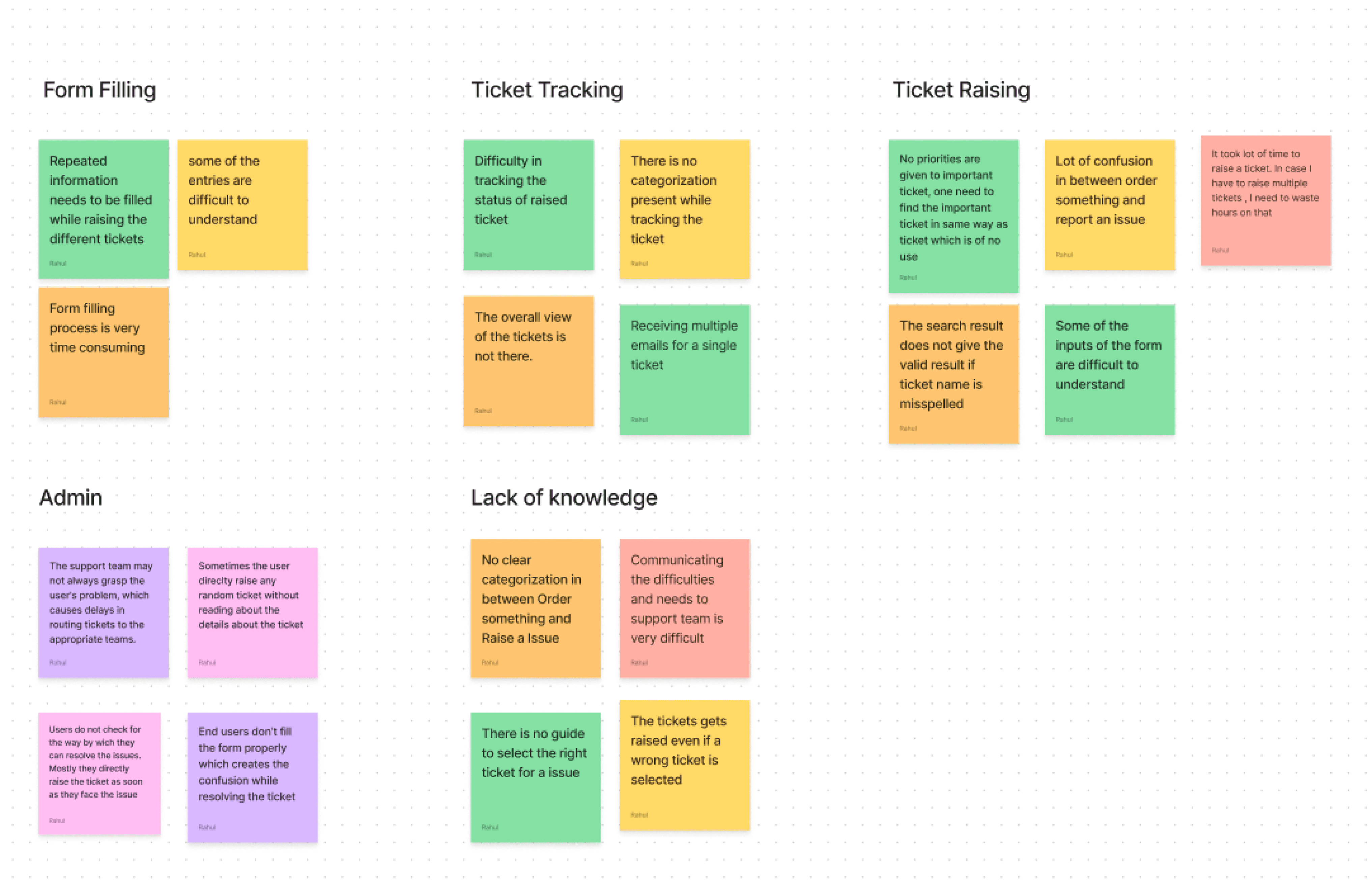
The quotes from the interviews were mapped in different clusters. Different iterations of clustering resulted in several problematic areas
Towards Solution
Defining the design goals and structuring a solution
Joining as a new employee is a headache with the current access request process. Requesting access feels like submitting multiple tickets for a circus.
There's no user-friendly dashboard, making it a scavenger hunt for the right applications.
Finding the required ticket on Service Now is very hectic task.
Even with the keyword search it shows lot of options from where we need to select any one ticket.
We need to fill the same type of form repeatedly to get the access to the various softwares or sevices.


For most of the time the issue for which the user raises the ticket is can be resolved by the users himself by performing the few steps.
Even for raising the simple issue I need to take lot of steps on service now. After taking these many steps most of the time I ended up raising a wrong request
Most of the time I ended up with raising a wrong category of ticket.


Discoverability
Affordance
Personalization
Ease of Use
Discoverability features enable employees to efficiently retrieve information. Search functionalities, intuitive navigation, and well-organized content contribute to quick access to required tickets, Raised Tickets, My Approvals and Order Something
Affordance ensures that users can effortlessly understand and use the features, including quick access to required tickets, Raised Tickets, My Approvals, and Order Something.
The design solution should focus on personalization as a pivotal feature. It adapts to individual user roles and preferences, utilizing specific user data to present relevant information.
The ease of use feature ensures that employees can leverage the discoverability and affordance elements with minimal effort, enhancing overall usability.




Playfull
Playful features, such as interactive widgets or interactive dashboard, can enhance employee engagement. Incorporating different play elements can increase the user engagement

Iteration
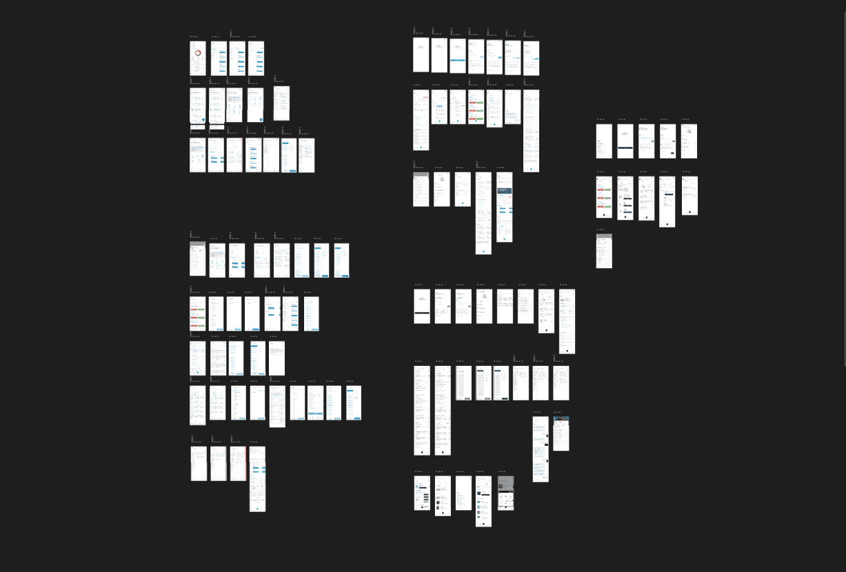
Several iterations of designs were made. These designs were shown to stakeholders who gave feedback on terms of overall impression, usability and implementation difficulty.
Botton Navigation
In the old version, when user wants to raise a ticket, they need to choose whether their Ticket comes under Order something or raise an issue. Even if they choose the correct option from two, under each of the two section there are lot many ticket option from which the user needs to choose any one of them and raise the ticket, possibility of getting the correct ticket from all the given options was very less, most of the time user ends up selecting the wrong ticket.
Earlier there were only 2 sections for Tickets in Service Now.
1. Order Something - In order something the user can request for any of the service. The user can order(raise ticket) for the access of the application or the softwares. The user can also order(raise ticket) if there is any hardware changes required in their respective devices. Simlilarly the user can order(raise a ticket) on many other requirements.
2. Raise an Issue - Under this section the user can raise any issue they are facing in any of the companies services.
Ensuring that the employees quickly find what they are looking for, I iterated a lot on bottom navigation. I aimed while designing the bottom navigation that all the functionalities for which the user has came to EPA should be available on bottom navigation, user don’t need to search on other screens for particular feature.
Categorization was the main problem in existing ticket raising system. I tried to provide the first level of categorisation in the bottom navigation itself. In the menu section the user can view all the first level of categories of the tickets.
New Categorization
Access
My IT
Order Something
Raise an issue
Previous Categorization
Order Something
Raise an issue

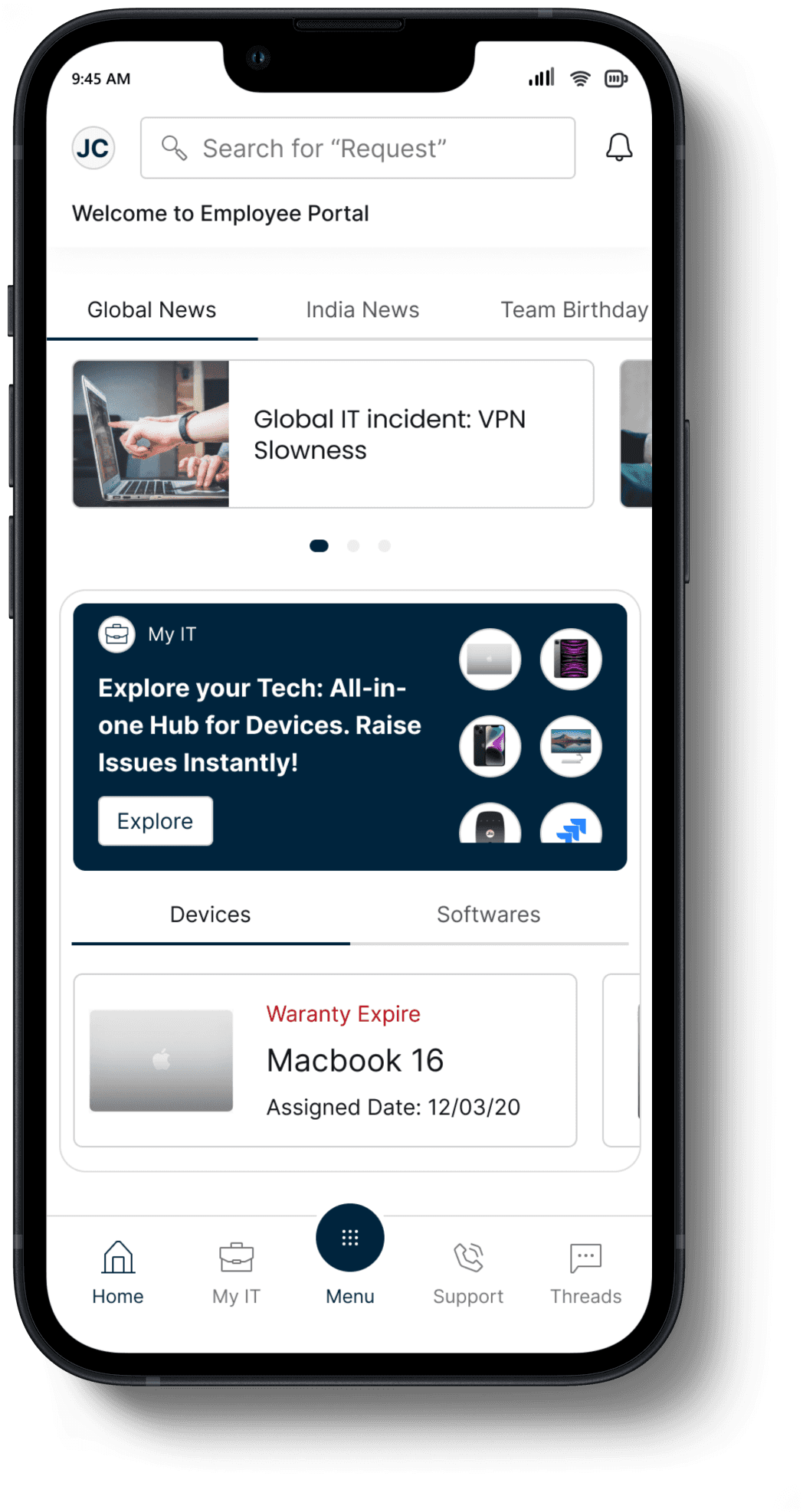
To engage user with the application I decided to add this section where user can view the global news, location based news, team birthdays etc.
The widget is added for my IT card to make it interactive and eye catching. Most of the tickets which are are raised are for hardware device issues or for software expiry or access issue. To make those tickets handy a My IT section has been added on home screen
If any action is needed to be taken from the end user side on any of the devices which are tagged to them or for the the softwares, the user will get alert from this section and can directly raise the ticket.
To make the important tickets visible and handy to the user, I have added the tabs such as Trending, Raised by the colleague, Role Specific. User can see all the important tickets from this section and can instantly raise a ticket.
For Access category of the Tickets, user can directly raise the tickets with just click on Request Access button.
Home Screen
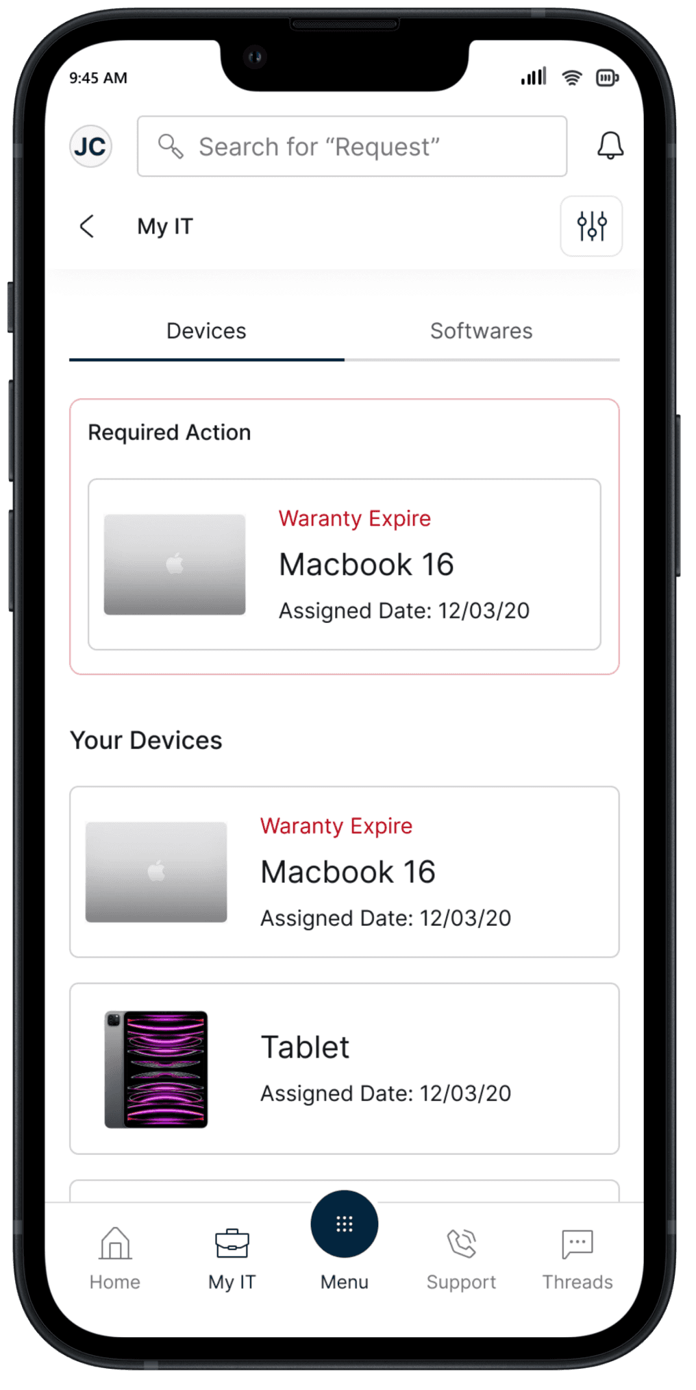
My IT
From the the previous data it was observed that the for most of the cases the user raise the ticket for the device issue and for the software issues they are having access of. Previously all this tickets were present is Order Something section and they were not handy for the user and there were many touchpoints for this user journey. So a decision is made that in EPA there will be complete different section for those kind of tickets and user can easily find and raise those tickets.
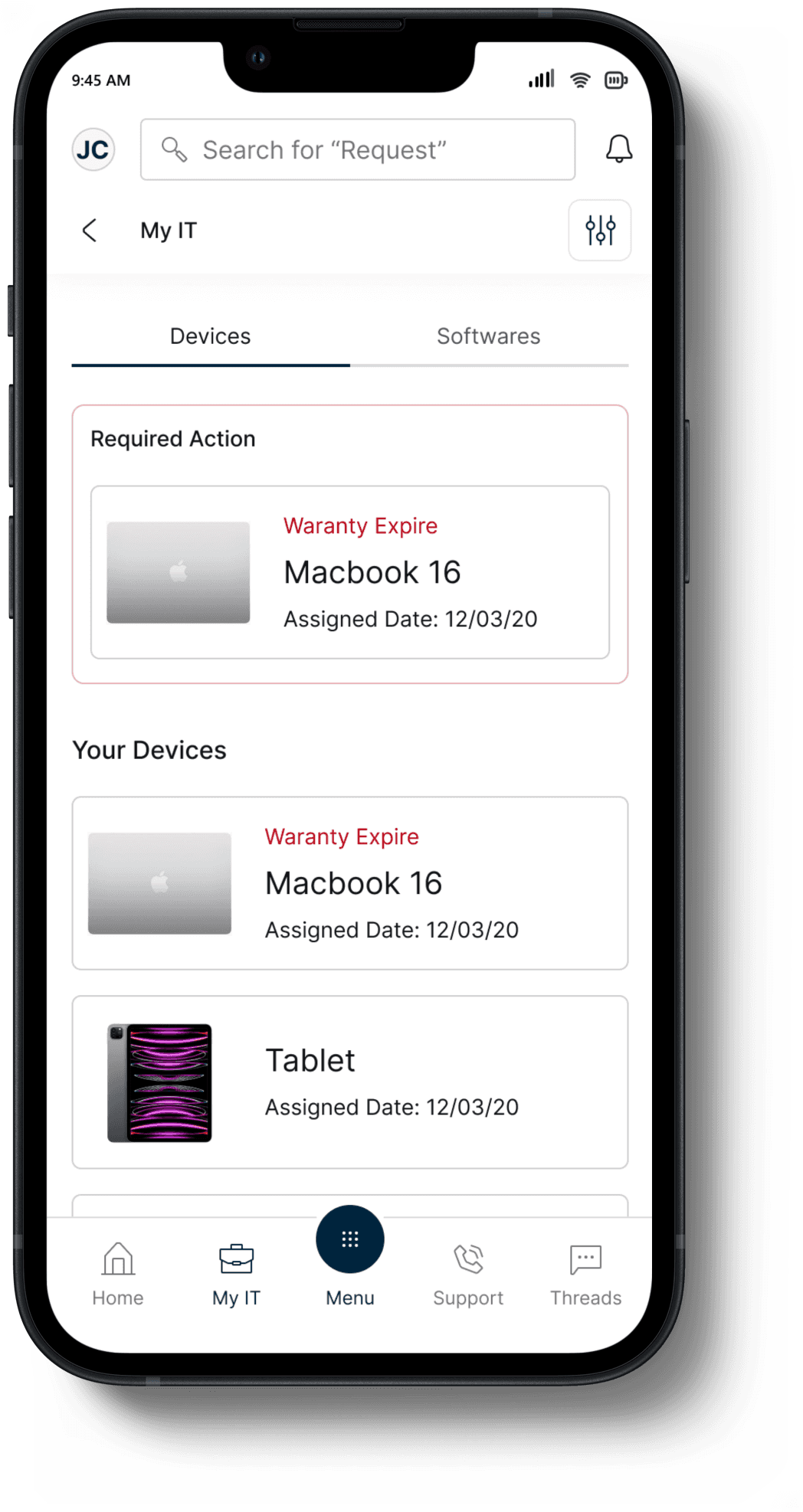
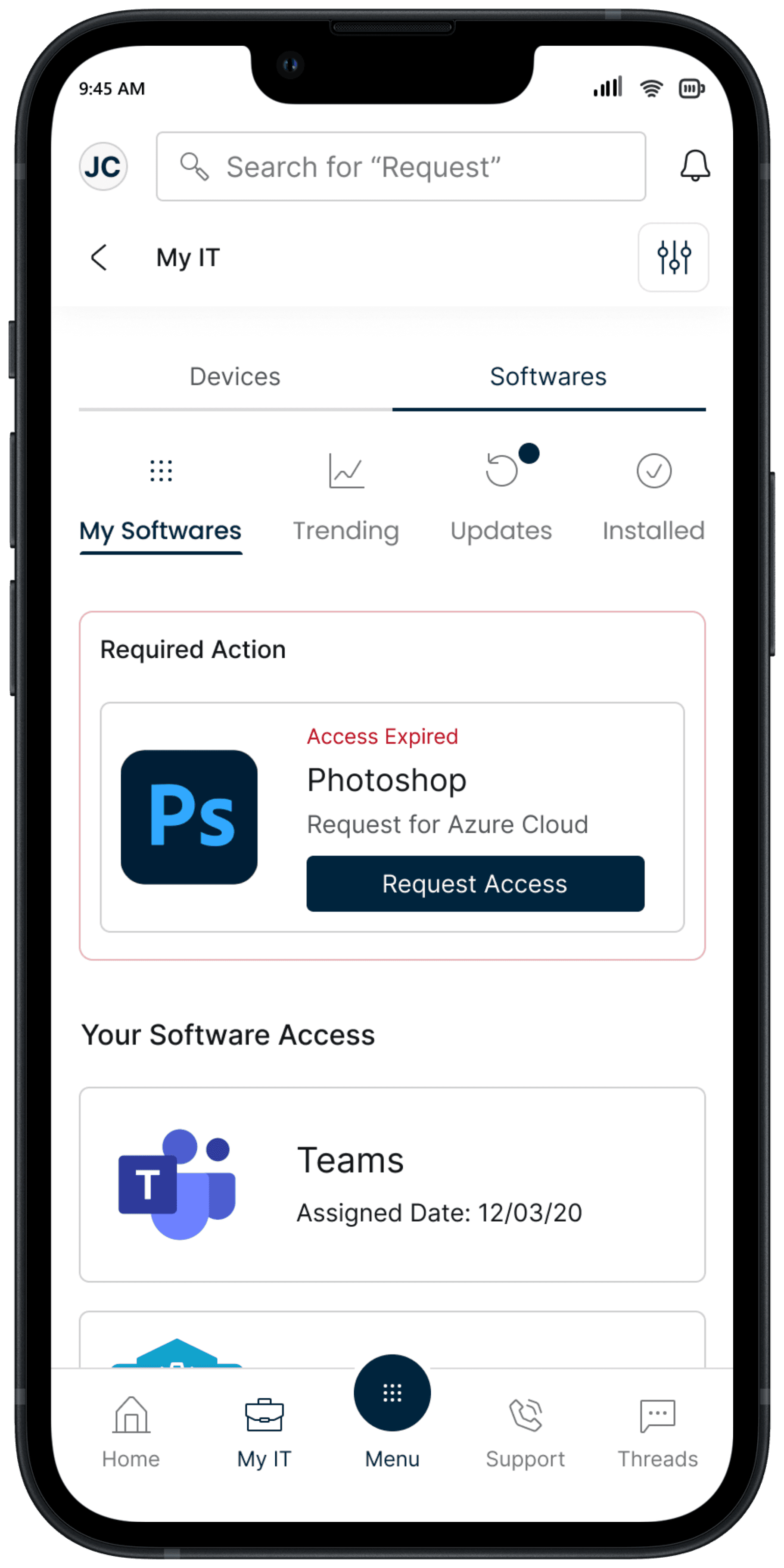
In My IT section the user can switch between the Devices(Hardwares) tagged to the user and the softwares for which the user has the access.
If there is any action which is required form from the user then the required action card will be upfront. This will notify the user and user can easily raise the ticket.
The list of all the devices which are tagged to the user is shown in your Devices section. If user is facing issue in any of them, the user can choose that particular device and select the the ticket and raise it.
In the software section, there will be a 4 sub tabs. The software for which the user has the access, the trending apps and software, the updates and all the company apps which are installed on the phone are shown in this tab. The purpose of listing all these softwares and apps was to make them handy to the user for raising a issue on them.
Access
There were many tickets for which the form filling process can be eliminated. Previously for such tickets also user need to fill the form to raise such tickets.
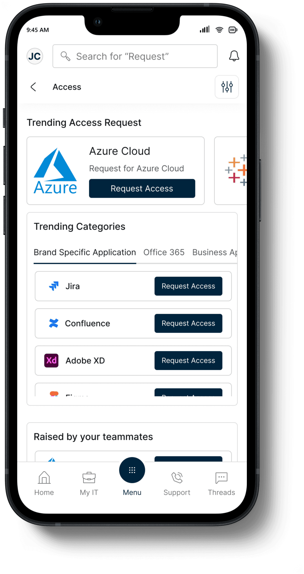
Under Access section all the tickets are listed for which the form filling process is not necessary. With just one click of the Request Access button the user can raise the ticket.
Multiple similar widgets are used to categorize the tickets and user can easily locate the desired tickets. In trending categories section the list of all the trending group will be there in Tabs form. Under each group respective trending tickets will be listed. User can scroll this tickets on widget and can directly raise a ticket.
Request
In the Request & Report Issue section all the tickets are shown which were there under order something & Report an Issue section in Service Now.
The cards and widgets are categorized in the same way as that on the access page to maintain the consistency.
Support
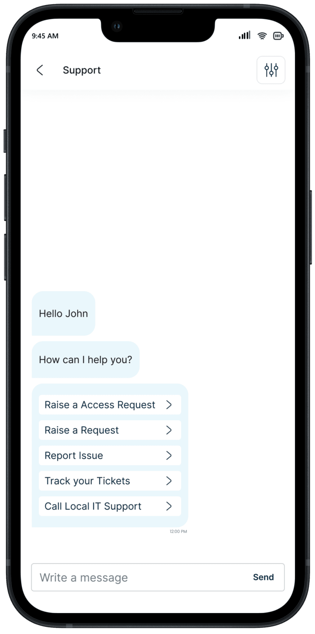
Users can easily raise tickets by utilizing the support feature. Within the support section, a smart chat assists users in finding and submitting tickets. This feature guides users on the necessary actions to take when encountering issues with any of the company's services, providing clear instructions on the steps they need to follow before raising the ticket.
Filtering the ticket
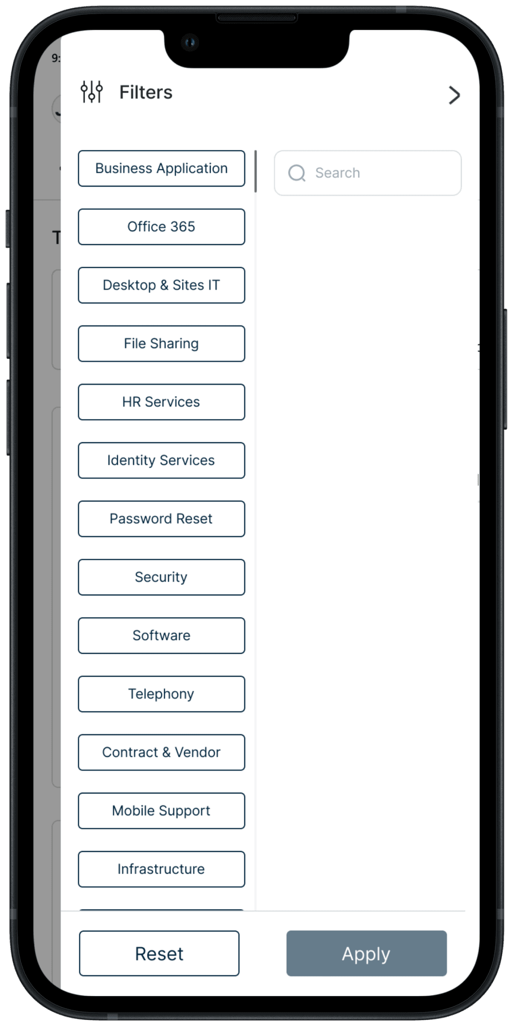
I used filters to let users select relevant tickets by reducing data sets to their most manageable, relevant results.
There are four stages in filtering the ticket. When the filter is applied before that stage, it alters the data of the subsequent filter.
Stage 1
Category Selection: Users start by selecting the category of products they are interested in.
Stage 2
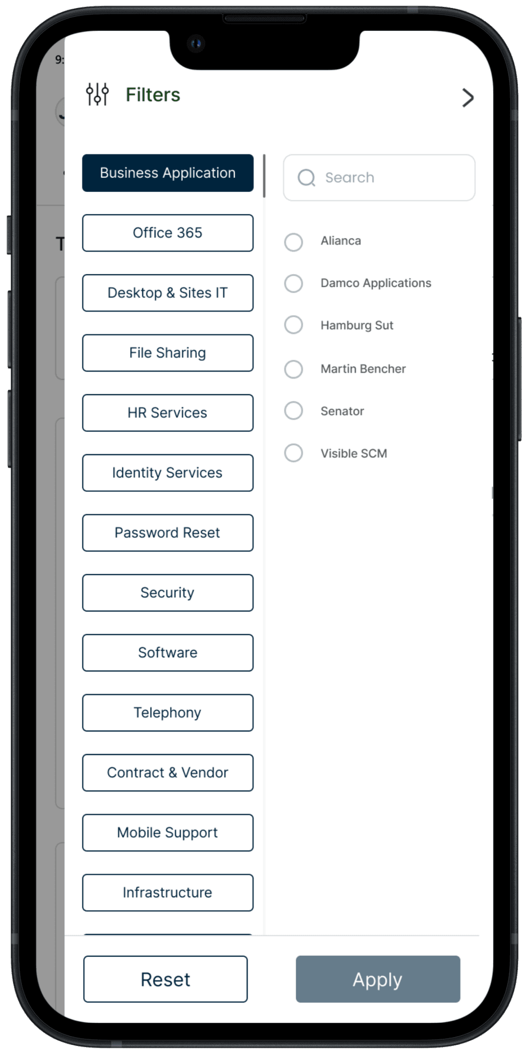
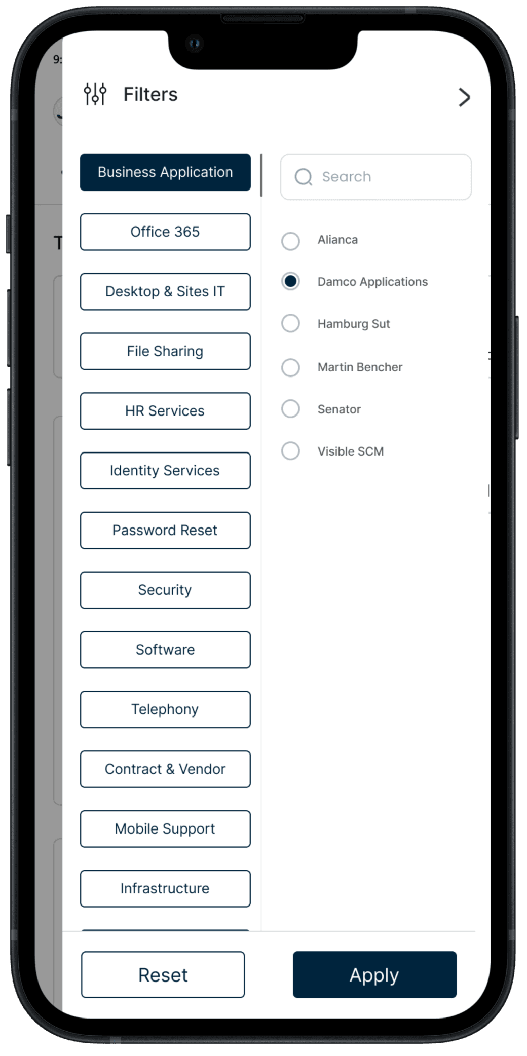
After choosing a category, users may further narrow down their search by selecting subcategories
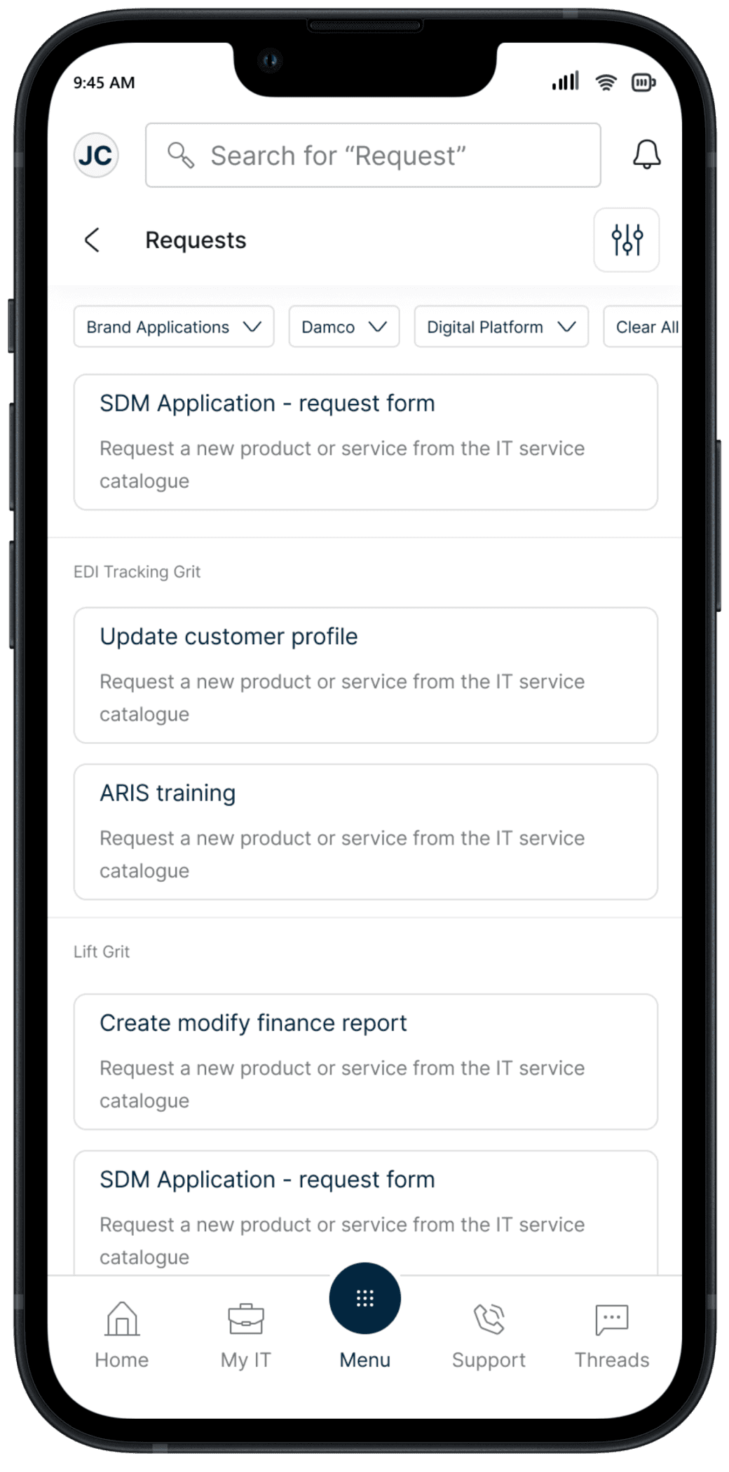
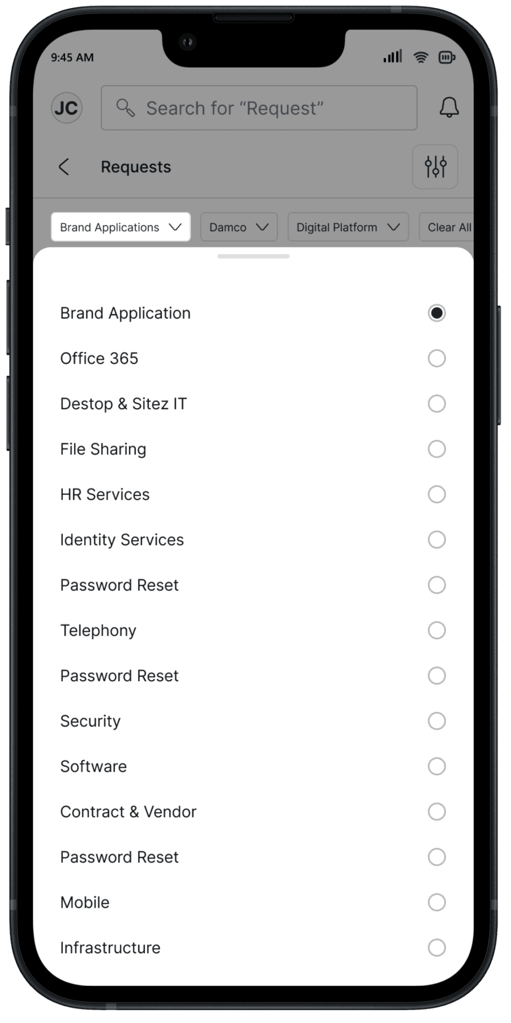
After applying the filter, the respective tickets will be available for the user to select.
User can change the filter form the live screen for better interaction. From the overlay screen user can select the category for the selected filter
User can change the filter form the live screen for better interaction. On selection of particular filter, user can select the category from the overlay screen.
After applying the filter for third stage, the data for the fourth stage will be available in groups form. The fourth stage filter is not provided as for fourth stage the data is very limited
Searching the Ticket
The search functionality will allow user to quickly locate specific ticket.
Employees can enter keywords, ticket numbers, or other search criteria, and the system will promptly display matching results.
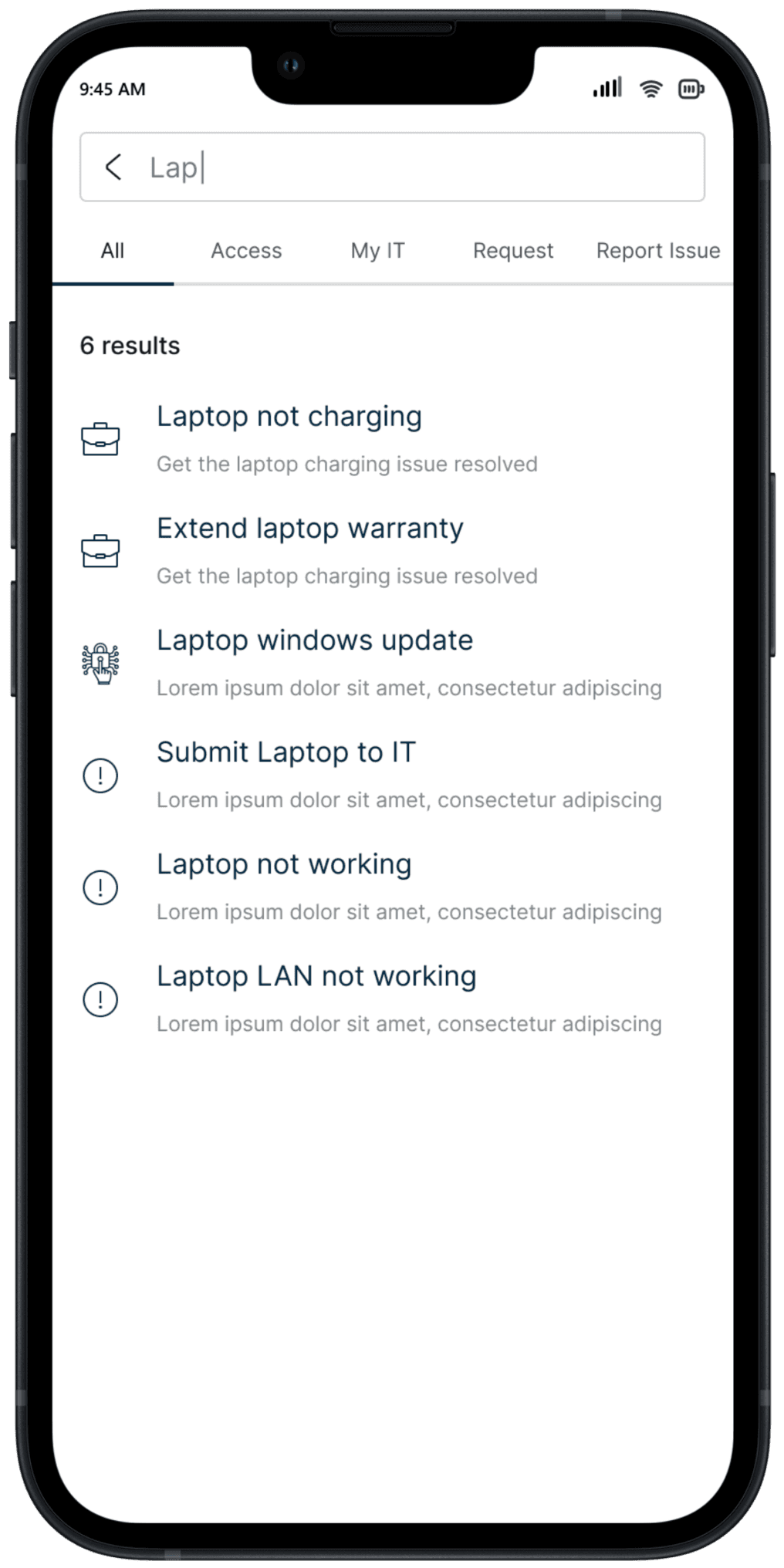
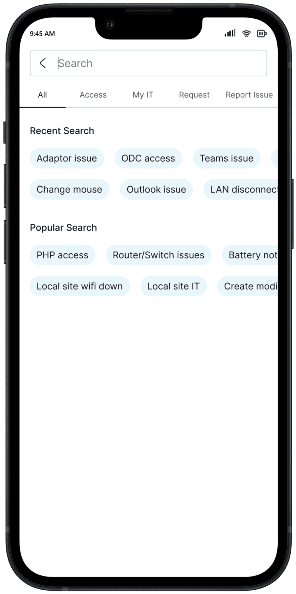
The number of results available is displayed. In this example, we can see clearly the 6 results, this gives the user an idea of how long it will take them to go through all the results.
The auto-suggestion feature in the search functionality will provide real-time, predictive suggestions as users type in the search bar.
Eliminating the form filling process
While raising the ticket from service now, user used to find that the form filling process is very tedious and repetitive. User needs to fill the form repeatedly for different tickets and they need to input the same information more often.
From the Admin interviews it was also found that, the user can resolve the issue by just following few steps but as users are not aware about the steps which needs to follow they end up raising the ticket.
Smart chat based solution is used to address various pain points on form filling process. After selection of the ticket the App will provide the guidance to resolve that issue. Even if the users are not able to resolve the issue by following those steps the app will raise the ticket by just asking the required fields and raise the ticket.
Other supoportive screens
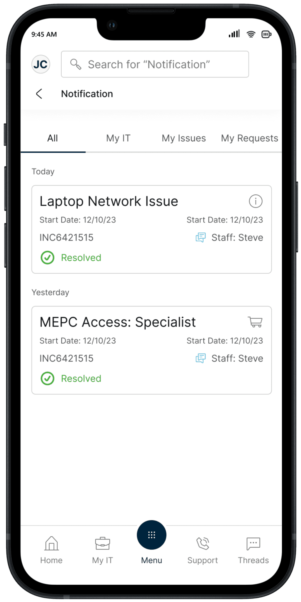
Notification
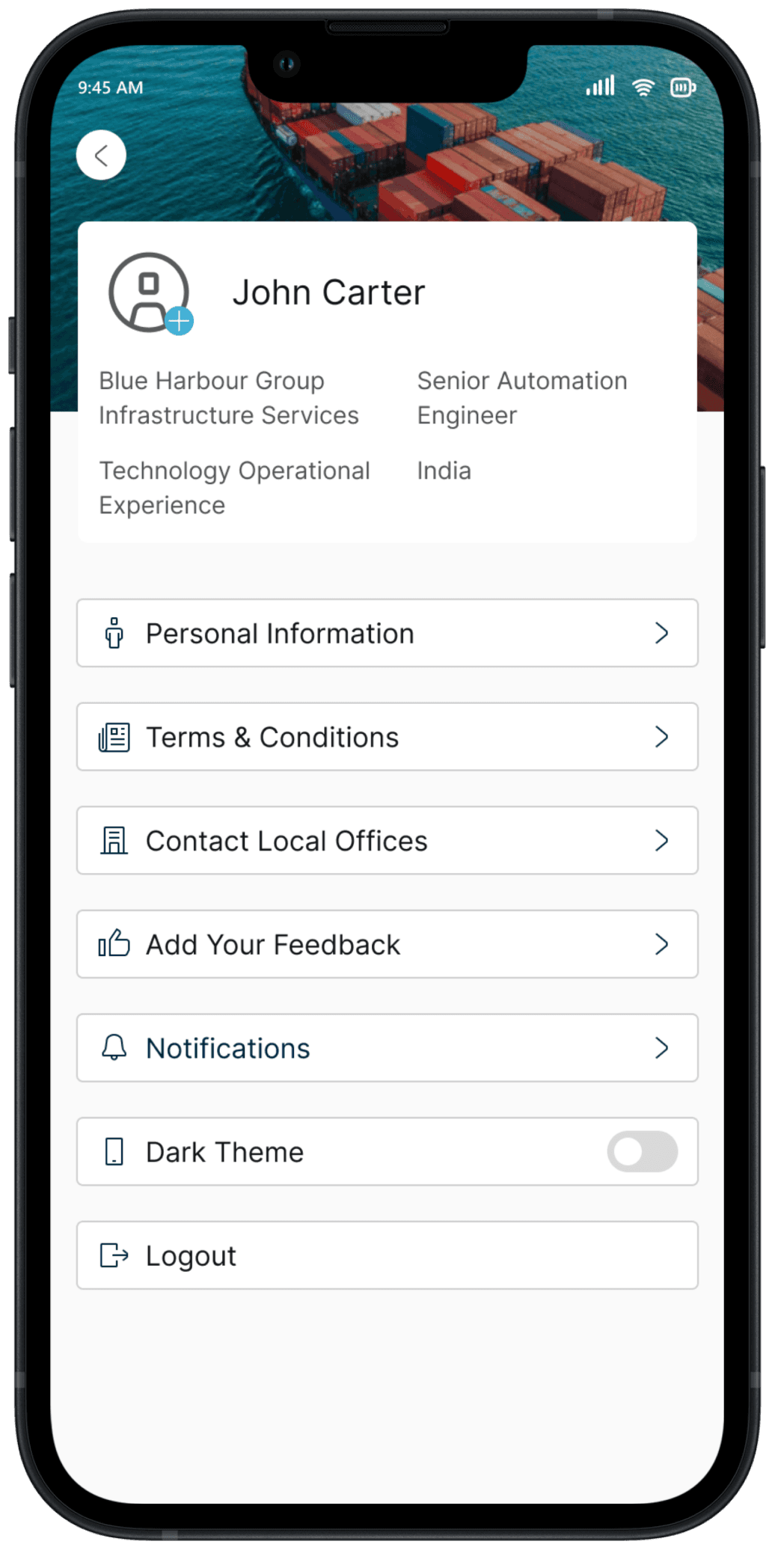
Profile
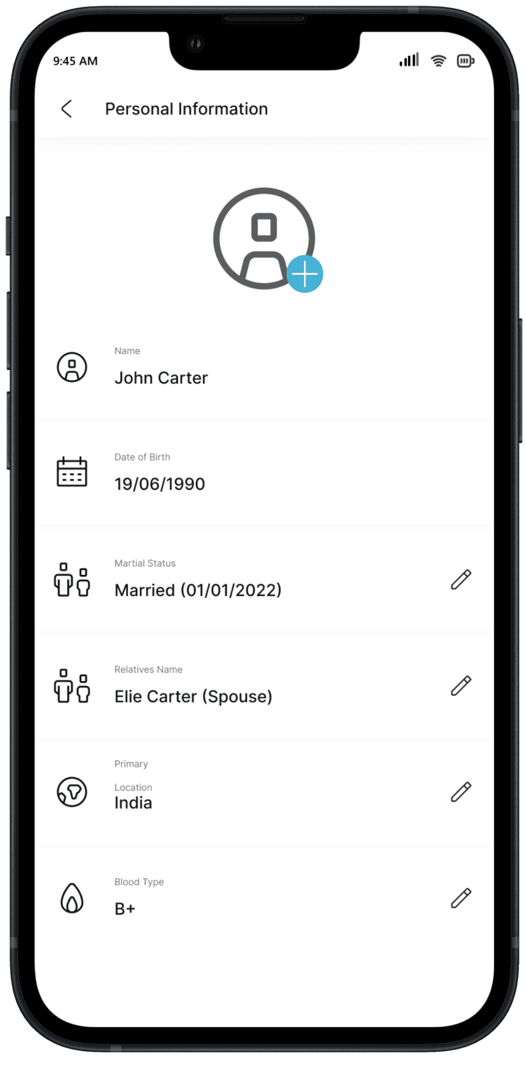
Personal Information
Complex Workflow Design: Dealing with IT ticket raising involves understanding complex workflows. Learning to simplify intricate processes for users without losing functionality is a crucial skill.
Information Architecture: Designing an Employee Portal Application requires thoughtful information architecture. I learned how to structure and organize information to enhance discoverability and usability.
Personalization in UX: Incorporating personalized features teaches how to tailor experiences to individual users. This involves understanding user roles, preferences, and creating adaptive interfaces.
Final Takeaways
Explore Other Work
Let's Talk
If there's something you'd like to discuss, let's connect and move things forward.
Product Design
In this project, I have designed the web app for a client that streamlines the Competency Assessment experience.
View Case
UI Design
UX Research
UX Research
My responsibilities were to improve the usability(Effectiveness, Satisfaction & Efficiency) of the canvas by keeping in mind the constraints of the design system and bringing the consistency throughout the canvas of the eQ technologic products.
View Case
UI Design
Heuristic Evaluation


Prototyping
UX Research
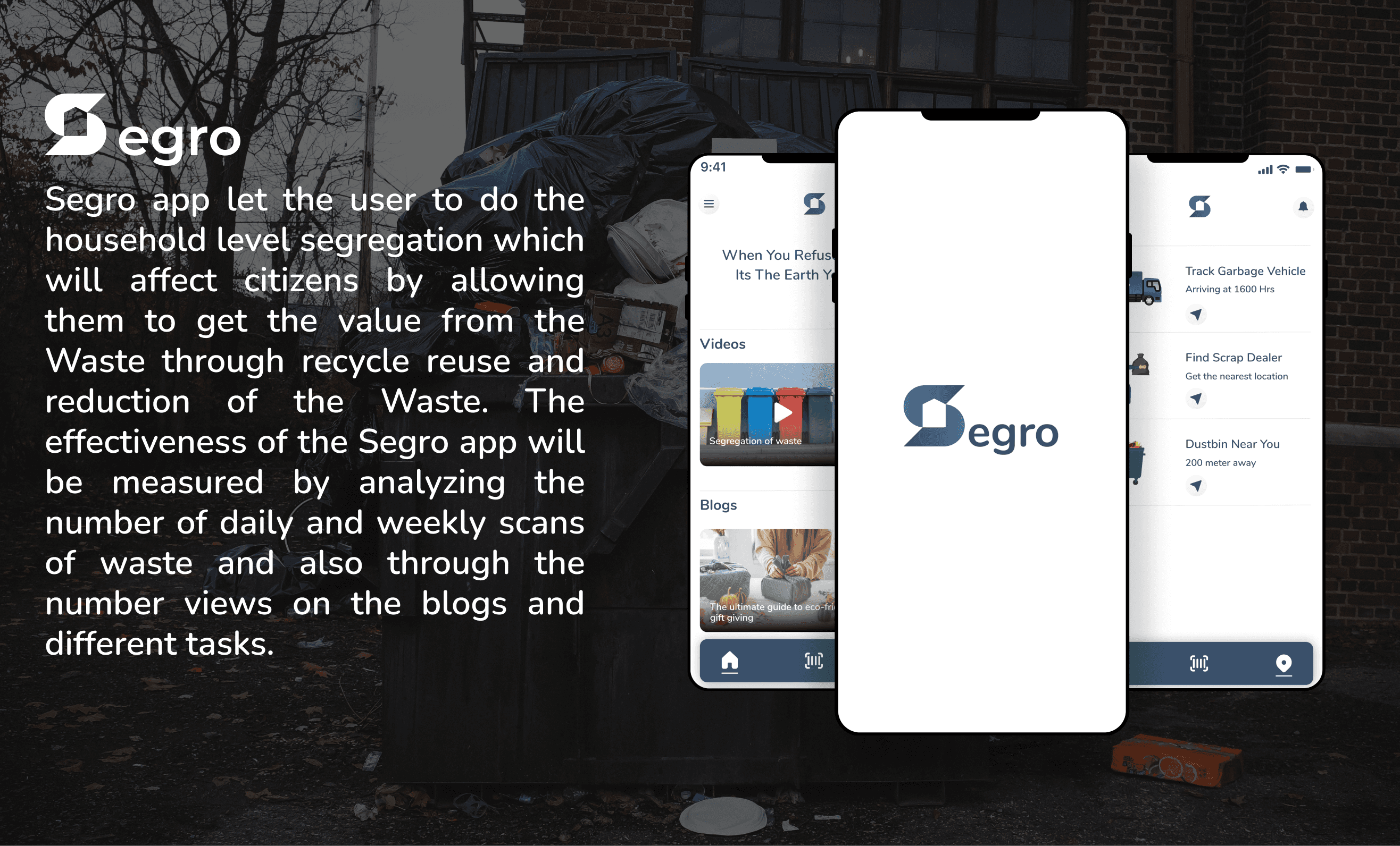
In this project I tried to integrate the technology with a properly designed system of household level segregation so that waste does not just end up in landfills but is processed and reused.
View Case
UI Design
Prototyping
Usability Testing
UX Research
In this project I tried to integrate the technology with a properly designed system of household level segregation so that waste does not just end up in landfills but is processed and reused.
Designing the personal finance management app
View Case
UI Design
Prototyping
Usability Testing
